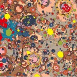
Ryan Medeiros sent me this image with the question would it be possible to create a flash movie that generated something like this?
 Like I say t all things, sure why not! Obviously to create this in Flash requires some thought. The success also depends on what you want to get out of this. Trying to recreate a natural system with AS is not easy. Though it may look random there are some subtle and complex patterns hidden in an image like this.Trying to recreate the image exactly might leave you disappointed. Giving yourself the latitude to come up with something close is obviously more likely to produce success.
The best place to start is with the image,by examining it very closely. A close look will start to give you an dea of the systems that you need to create.
The first thing that I noticed was hte strong color palette. The colors are not random. Most are less satuarated and fall in a range of browns and pinks. The few brighter colors that appear, appear less often. The red and yellow appear far less often than the browns and pinks. There is also a bright blue.
The shapes are mostly circular. But not perfect circles. Often one shape appears within another. Usualy the inner shape is near the center and doesn’t meet the edge of it’s container. The inner shapes are almost always in a brighter color.
After examining the image for a while, and knowing that it is a map of mineral deposits on the moon. I begin to see a pattern where the circular shapes represent craters. Thinking this way you begin to see two layers of shapes. The lower layer seems to give me the impression of the regular landscape of the moon. Comprised of shapes that are not circular, the shapes on this layer relate more to topographical shapes. The upper layer is mostly circluar shapes.Then there are a few dashed lines that run across the image.
Each shape appears as a solid fill with a single pixel black stroke. A few the shapes show some horizontal streaks in the fill. I’m going to assume that these are artifacts from compression and ignore this.
The sizes of the shapes also contribute to the unique look of the image. Most of the circular shapes fall in the small to tiny category. While few of the shapes are medium to large. Let’s say samll to tiny is 40 pixels and smaller. Medium to large is larger than 40 pixels.
There is a lot more to see and examine. The longer you look the more you will see. What I’ve covered here would give you plenty to work with. Of course the more you study and the more you can measure and quantify the more accurate the final work will be.
How would you go about creating something like this? Drawing shapes with a stroke and solid fill is easily accomplished with the Drawing API. Methods of the graphics subclass like: beginFill, lineStyle, lineTo and curveTo would cover it all.
You might decide to work with regular shapes like ellipses and or rectangles. This would not match the image exactly but could still get the essence of the image look artful. In this case you could also make use of drawEllipse, drawRect.
For ease of working I think I would try and break the work into several classes. A class to represent each of the shapes would be a convenient way to handle them. This would make it easier to create an alogrithm to generate and distribute these shapes across the entire image.
I pointed out earlier that the image seemed to have shapes of different types in a fore ground and background layer. This might require different classes to generate each of the different types of shapes.
There’s a few thoughts to get started on this. Maybe I’ll come back to this later.